The archives
Return to the
Now spinning
page
Explorations, Early Summer
June - July 2010
28 June 2010

Sometimes (most times!) spinning is the thing that calls me away from my worries. You take your problems, quiet your mind, and let everything dissolve in the beauty of fibre, twist, rhythm and light. ...Right now, though, I want to weave!
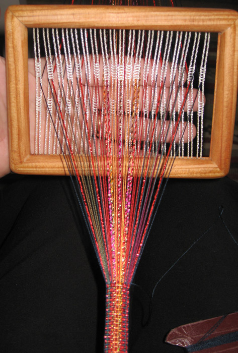
In bestowing order to the surroundings here, lots of unfinished projects have bobbed to the surface. This little sparkly band is one of them (click the thumbnail for a bigger picture, or here for a detail view).
It began life as a demo warp at a show in March -- and like most demo warps, it came home afterwards in a mostly-unfinished state and was quickly forgotten. When it emerged from hiding last week, I decided it was time to finish it!
Most of the time with these semi-rigid heddles, I use a very simple set-up: attach the far end of the warp to something (like the coffee table), clamp "my" end of the warp to the arm of my chair, then just weave! As the weaving gets longer, I scoot my chair forward and re-clamp.
That wasn't possible this time. In the, um, swirling creative flow of our living room (no, I won't show a photo!), my normal weaving chair was busy. Completely buried, in fact. ...What's a weaver to do??
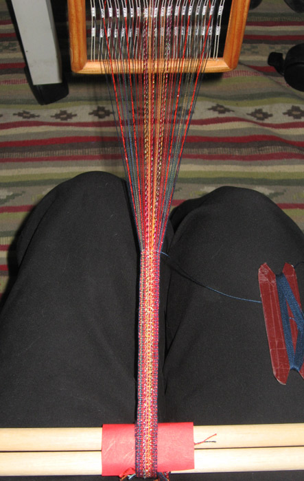
Backstrap to the rescue! :-)
My past experiences with backstrap weaving had not been happy. It was uncomfortable, felt unstable, was weird to control -- and the phone would always, always ring as soon as I'd gotten resigned to sitting there, helplessly tied to my weaving.
This time, guided by a great tutorial on Weavezine and tips from the backstrap group on Weavolution (and a cordless phone!), everything was going to be different. I made a comfortable backstrap from an old woven sample, found some good dowels in my wood stash, and set everything up.

Guess what?? It was a blast!! ...It was stable, fast, easy to control, had excellent tension -- and was super-comfortable! How on earth could I have not been doing this all this time???
Meanwhile, back to the band, because there are a couple of things worth noting. Its yarns are mostly pretty fine -- hand-dyed, variegated cottons sold for embroidery (about the weight of 20/2 weaving yarns). I didn't try to line up their colour shifts (didn't want to!), so the variegations change and dance gently all along the length of the band. ...Besides the cottons, it has two kinds of sparkly yarn: a strong red that provides a "flash" near the borders, and a glimmering, thicker yarn in the middle, whose colours run from red through yellow-orange to gold to fuchsia.
With the heddle set up on the backstrap, I get great mileage from the yarn -- the little group of strands spanning 7 or 8 inches across the bottom of the yarns photo is the loom waste (yes, all of it!) :-)
That was a totally successful weaving rescue. And because one thing always leads to another...
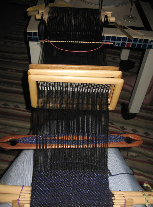
...I set up the long-neglected scarf warp (which I hadn't been enjoying, not at all -- in January I grumbled it was weaving while walking a tight rope) onto a backstrap of its own (left). The transfer was traumatic -- but already the weaving is more pleasant, and the warp tension problems (in the other setup the warp was getting bumped all the time!) have virtually disappeared. I've woven a few more inches since taking this photo, and the twill line is now straight and smooth.
By the way, that's three semi-rigid heddles, threaded for twill. The slim stick with the pink loop of yarn beyond the heddles is a shed stick for the fourth "shaft". ...I'll get around to writing this in an article one day, because it's pretty pleasant to weave -- once you've swapped an awkward set-up for a more stable one. ;-)
I love this. My portable weaving has suddenly gotten even more portable!
End notes, for inquiring minds
♦ The yarns used in the band came from many sources, all vendors at the Knitting & Stitching shows in England and Ireland. Bands like this lend themselves to mixed warps, and almost any yarn is fair game!
♦ To see a draft of this band's threading, click here. (The draft is posted as one of the photos -- click on its thumbnail, and all will be revealed.)
♦ Besides the guidance listed above, I highly recommend Laverne Waddington's monograph on weaving Andean Pebble Weave on a backstrap loom. It's available as an e-book from Weavezine.
♦ The three heddles in that last photo are prototypes of a wider version of my semi-rigid heddle. The wider version isn't yet available for purchase, but the standard version is -- click here to learn more.
21 June 2010
Pink and green.
It took decades before I could appreciate Pink, but this peony shows many of the reasons for doing so. The rich, deep pink at the centre is like memory, surrounded by wispy, etherially delicate petals, unfolding like fleeting thoughts. Out on the edges, a different pink flirts with shadows but remains delicate, ghostly, haunting.
Pink has many faces. In the company of Green, it deepens, or skips with lightness; it runs outside to play, or it settles into evening twilight.
You never know when colours will reach out, take your hands, and guide your next textile act. But there it was, as I set out to make a small tassel that escaped from the ordinary: Pink and Green. Message received.
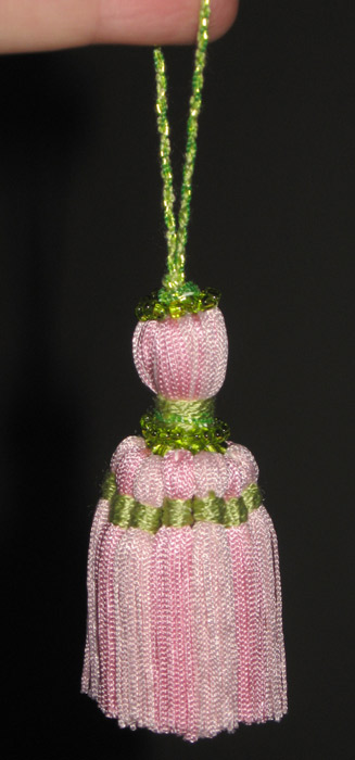
This tassel (right) is complex, but is still a soft-headed tassel (meaning it doesn't use a mould). Like most soft-headed tassels, it started as a bundle of threads (its future skirt) bound around the knot of its hanging cord. This time, to make the head rounder and firmer, the skirt was folded a second time around the head, then bound tightly.
The skirt you see here is actually an overskirt, entirely encircling the original tassel. If your eyes are sensitive to colour, you'll see that this overskirt is made of two shades of pink -- and is actually a series of small, slender tassels set shoulder-to-shoulder.
The tassel's green elements are (from top to bottom) its hanging cord, a "top-knot" decoration made of thread and glass beads, a binding at the neck made of two kinds of thread and glass beads, and binding threads on each of the mini-tassels of the overskirt. In real life, the green is softer than it appears in the photo -- it manages to dance with the pinks without stepping on their toes.
Of course I forgot to take photos of the actual making of the tassel, so I'll now need to make another -- but it pleases me! Its decorations and its structure are nearly inseparable. That's my favourite kind of embellishment. :-)
Clearly, the tassel saga continues. Stay tuned.
17 June 2010
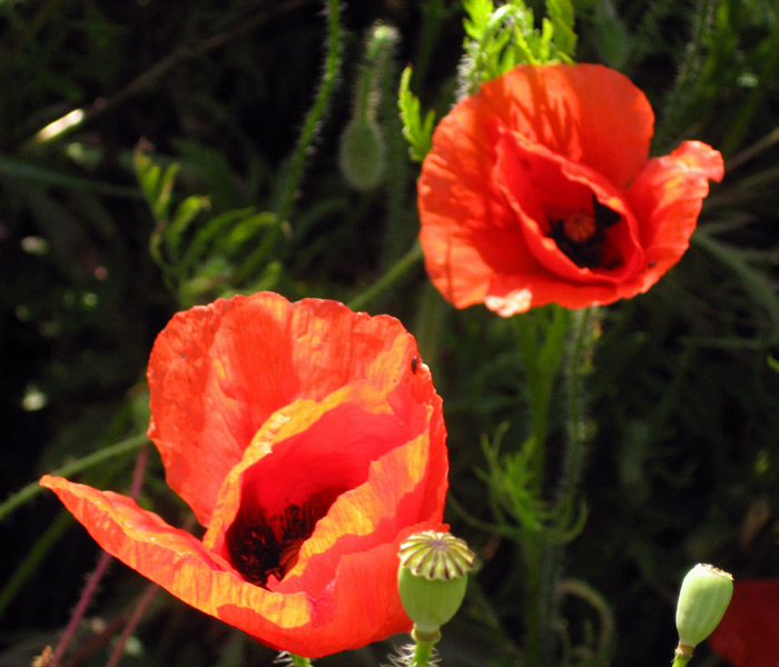
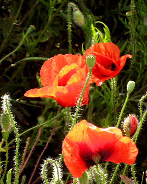
It still hasn't warmed up to a seasonal temperature outside, but the coquelicots are in bloom anyway! (left) It's a colour to warm the heart. Seen straight-on, it's a true, true red. Backlit, it bursts into a flash of oranges and yellows. The green of its foliage, buds, and seed heads serves as a foil to display that magnificent red in all its grandeur. Red, red, poppy red.
The arrival of the coquelicots, of course, urged my dyepot into action. The dyes are synthetic, but inspiration for the colour is 100% from Nature!
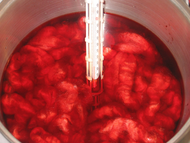
This Coquelicot silk is one of my favourite colours to dye. Because I can't know what happens to the silk fibre before it gets to my supplier, I have to guess whether or not each batch of silk I order will respond to dyes in the same way -- very often, they don't.
 Some batches of silk will, for example, take the yellow pigments and hang onto them, delivering a more intense yellow than planned; others will reject the yellow, delivering a pale straw colour when I'd wanted sunny buttercups. Some batches will drink deeply of the blue pigments, shifting the greens and purples toward indigo and forcing me to recalculate the dye formulas.
This unpredictability is a special quality of silk.
The Coquelicot colour, though, remains lovely (left), no matter how its particular batch of silk responds to the dyebath. If the silk shifts the colour toward yellow, we have a brilliantly sunny Coquelicot -- poppies in a summer field. If it shifts it toward the blue side of red, we have a rich red, like the colour near the heart of the flower -- a red that sings. ...It just can't go wrong. :-)
This dye colour shows all the nuances of the flower for which it's named: true reds, flashes of scarlet, and occasional unexpected blazes of orange and yellow, like sunlight passing through petals.
End notes, for inquiring minds
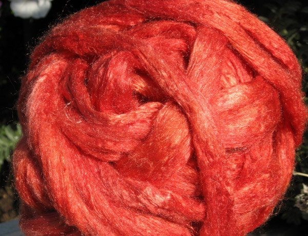
♦ The silk shown above appears in its freshly-dried-after-dyeing state. It is tussah silk, known for its addictive sparkle and smooth drafting. It is (of course!) available for purchase -- click here to learn more.
11 June 2010
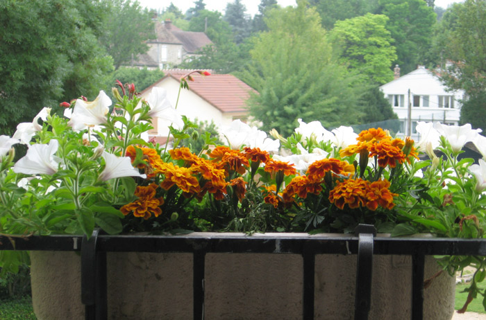
I've just returned from a quick trip to visit a friend in southwestern France, and as you can perhaps guess from the size of the marigolds in my windowbox, it's not really summertime here yet. In a "normal" year, they would be at least twice this size by mid-June. The temperatures are still in a range more suited to March or April -- and (grumble, grumble) the warmth coming from our spare heater feels really good!
It wasn't much warmer in southwestern France. We had one lovely day, followed by several days of deluge. We were staying in what used to be a Catholic girls' boarding school, La Pension de Sainte Anne. It's now a lovely and comfortable hotel, but vestiges of its past are clear to view and add much charm and quiet to the place.
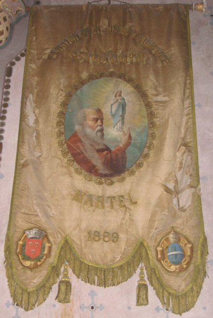
Late one rainy afternoon, I took refuge in the on-site chapel, and after my eyes adjusted to the gloom, I found a surprising banner (right), its silk fabric slowly falling into ruin. The inscription at the top reads Pension de N. Dme du Calvaire (the name of another boarding school), and below that, St Joachim (the school's patron saint, perhaps?). Below the painted illustration is the name of the town, Martel, and the date 1889. It was apparently a banner made on the occasion of a church-and-school-related gathering of some kind.
Most of the details were impossible to see in the gloom of the chapel (I discovered them only after taking a close look at the photos) -- but it was clear that despite its sad condition, the banner displayed some exquisite handwork.
The goldwork embroidery on the banner is completely intact and demonstrates a careful quest for perfection. The satin-stitched lettering is clear and precise, and the fan-like stitching surrounding the central picture is embroidery -- but echoes shapes and motifs of bobbin lace.
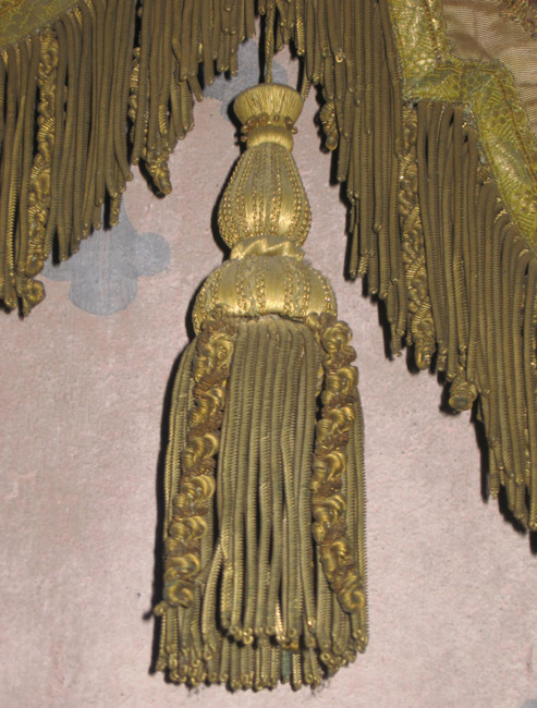
Another example of fine workmanship: this goldwork tassel (left), its head made of three (possibly four) moulds carefully wrapped in fine gold thread, then embellished with sequins (on the uppermost mould), and tiny cords made expressly for this job (the two lower moulds). Another mould hidden inside the tassel skirt gives the flamboyant skirt both fullness and form.
The gold in this goldwork is real metal, and most likely real gold (hammered incredibly thin before receiving its final thread form). Despite the fineness of the work, the banner must be very heavy!
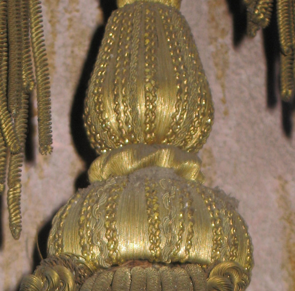

The banner represents many different and specific skills: sewing (to construct the banner, because it's not just a single layer of cloth!), specialized embroidery, painting, and passementerie (the tassels, fringe, and band with which they're mounted on the banner).
Gold on gold, spiral within spiral -- it's hard to imagine how many hands worked to create this humble, forgotten masterpiece.
01 June 2010
One of the great things about baking cookies is that you can eat all the "mistakes". (Proven fact.)
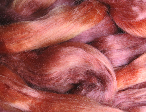
One of the great things about dyeing lots of silk is that when colours aren't quite "right", you get to spin them yourself! ...So as a counterpoint to the delicious deep purples of the past week or so, we've moved into the gleaming warmth of coppers.
When I was fine-tuning the silk colour that would become Copper (which you can see on the Silk fibres page of this website), my dyepot took a few wrong turns. Those wrong turns helped define the colour, and they're good enough in their own right -- they just didn't fit the image I had in my mind. Instead of Copper, they were copper-like.
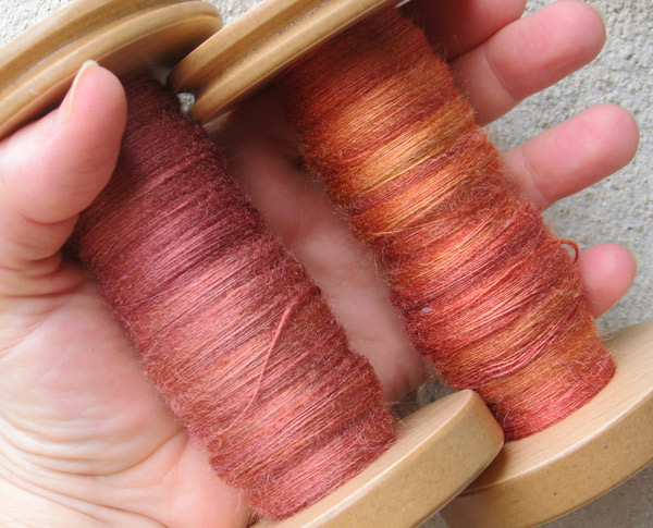
This new plunge into coppery spinning uses two such mistakes -- one, a touch too dusky, the other, a little too orange. I spun about 350 yards of each, and in the form of singles, their colour characteristics show more distinctly (right). They're not bad, really -- it's just that the duskier one isn't quite ruddy enough to be a rich colour on its own, and the other is... well, it matches the basketball that resides in our living room. ;-) I was pretty sure they'd look nice plied together -- but you can't be sure until the yarn starts piling up on the bobbin....
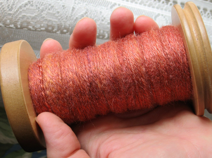
And there's the proof in the plying (left). I like it! It's warm and luminous -- and even though this isn't a colour I normally seek out, I want to figure out how I can wear it. Shawl? Scarf? Jacket? Blouse? It could work in any of those settings, with some help from other silks in other colours. ...There are more "mistakes" in the box. By they time they've all been spun and plied, I'll probably have an idea.
For now -- this is good. :-)
Return to the Archive directory page
Return to the Now spinning page